
Evergreen Fonts: The Wisdom of Massimo Vignelli

Typography plays a huge role in book design and publishing, but many authors (and readers, for that matter) don’t pay much attention to it.
With so many fonts available, the choice can be overwhelming. But decades ago, renowned Italian designer Massimo Vignelli devised a simple system for parsing through this ever-growing mire of tantalizing typefaces. His advice? You only need five fonts. While opinions vary on which ones he meant, the most commonly cited choices are Garamond, Bodoni, Helvetica, Times, and Century. These fonts have stood the test of time and are still widely used in all kinds of design today, especially in book design.
Some designers might wonder, “Why limit myself to just five fonts?” This is especially true in the digital age, where thousands of fonts are available at the click of a button. The reason is that these fonts were carefully designed to be clear, readable, and stylish, and they’ve stood the test of time. If you use these fonts, it’s unlikely that your book’s typesetting will quickly go out of style. If you’re a self-publishing author design their own book and find yourself asking, “Which font do I use in my book?”, use one of these: you’re highly unlikely to go wrong (professional setting is essential, too).
Bonus: Read my recent blog post for the rundown on why good typesetting matters.
Below, we’ll explore each of these five fonts—their history, unique characteristics, and why they continue to be essential in book design. The main takeaway? Good typography isn’t about making text look flashy—it’s about making it easy and enjoyable to read. The best fonts ensure that the words themselves are the focus, not the design surrounding them.
1. Garamond
History:
Garamond is named after Claude Garamond, a French printer from the 1500s. His letter designs were based on Renaissance handwriting, making them feel classic and natural. Over time, different versions of Garamond have been developed, but they all retain the smooth, elegant letter shapes that make the font so popular.
Why It’s a Staple:
Garamond is elegant and highly readable, which is why it has been used for centuries in novels, essays, and poetry. Its fluid letter shapes help guide the eye along the page, making long reading sessions comfortable. It works well in small sizes, making it ideal for book interiors. If you pick up a classic book, there’s a good chance it’s printed in some version of Garamond. Many publishers trust this font because it gives books a timeless, sophisticated feel.
Is there such a thing as a perfect typeface? Maybe not, but Garamond comes closest in my opinion. I used Garamond in about 70% of the books I typeset last year.

2. Bodoni
History:
Bodoni was created by Italian printer Giambattista Bodoni in the late 1700s. He was inspired by another famous printer, John Baskerville, and sought to design a font that was crisp, symmetrical, and modern for its time. Unlike older fonts with softer edges, Bodoni’s design features sharp contrasts between thick and thin lines, giving it a bold and stylish look.
Why It’s a Staple:
Bodoni’s high contrast makes it visually striking and elegant. While it’s not ideal for body text due to its extreme stroke variations, it shines in titles, chapter headings, and book covers. It adds a touch of sophistication and grandeur to any page. Some fashion magazines and luxury brands also favour Bodoni because of its refined and dramatic appearance.
Warning when using Didone fonts in book design: the serifs on fonts like Didot and some versions of Bodoni don’t render well when printed by Amazon KDP. Amazon’s print quality (at least for black and white, all-text books) can be a touch faint, which makes the already-slim serifs of many Didone fonts nearly invisible. If you’re uploading to Amazon KDP, try Garamond or Times New Roman instead.
Bonus: I discussed Bodoni in a Typeface Tuesday video about Didone fonts last year. Check it out here!

3. Helvetica
History:
Helvetica was created in 1957 by Swiss designer Max Miedinger. It was designed to be simple, clear, and easy to read in various applications. As a hallmark of the “International Typographic Style,” Helvetica became widely adopted for its clean, functional aesthetic. Over time, it became one of the most used fonts worldwide.
Why It’s a Staple:
Although Helvetica is a sans-serif font (meaning it lacks the small lines at the ends of letters), it remains highly useful in publishing. It is frequently used for chapter titles, captions, and book covers due to its bold, neutral, and easy-to-read structure. Helvetica’s clean and modern look makes it an excellent choice for contemporary books. It is also widely used in advertising, branding, and even road signs because of its exceptional legibility.
My goal for this year is to set a book entirely in Helvetica. I’ve never done it before, but I think with the right approach and appropriate subject matter, it could look wonderful. Helvetica Neue might be a more modern alternative, though.
Bonus: Check out my Typeface Tuesday video on the history of Helvetica

4. Times (Times New Roman)
History:
Times New Roman was created in 1931 for The Times newspaper in London. Designer Stanley Morison sought to develop a typeface that improved readability while maximizing space on the page. The result was a font that was clear, efficient, and easy to print in newspapers and books alike.
Why It’s a Staple:
Times New Roman is compact and highly readable, making it one of the most commonly used fonts in books, newspapers, and academic papers. While it may not be flashy, its strength lies in its reliability—it presents text clearly and efficiently. Many textbooks, reports, and research papers use Times New Roman because of its professional and traditional look. If you’ve ever written an essay for school, chances are you’ve used Times New Roman.
Bonus: Check out my Typeface Tuesday video on the origins of Times New Roman

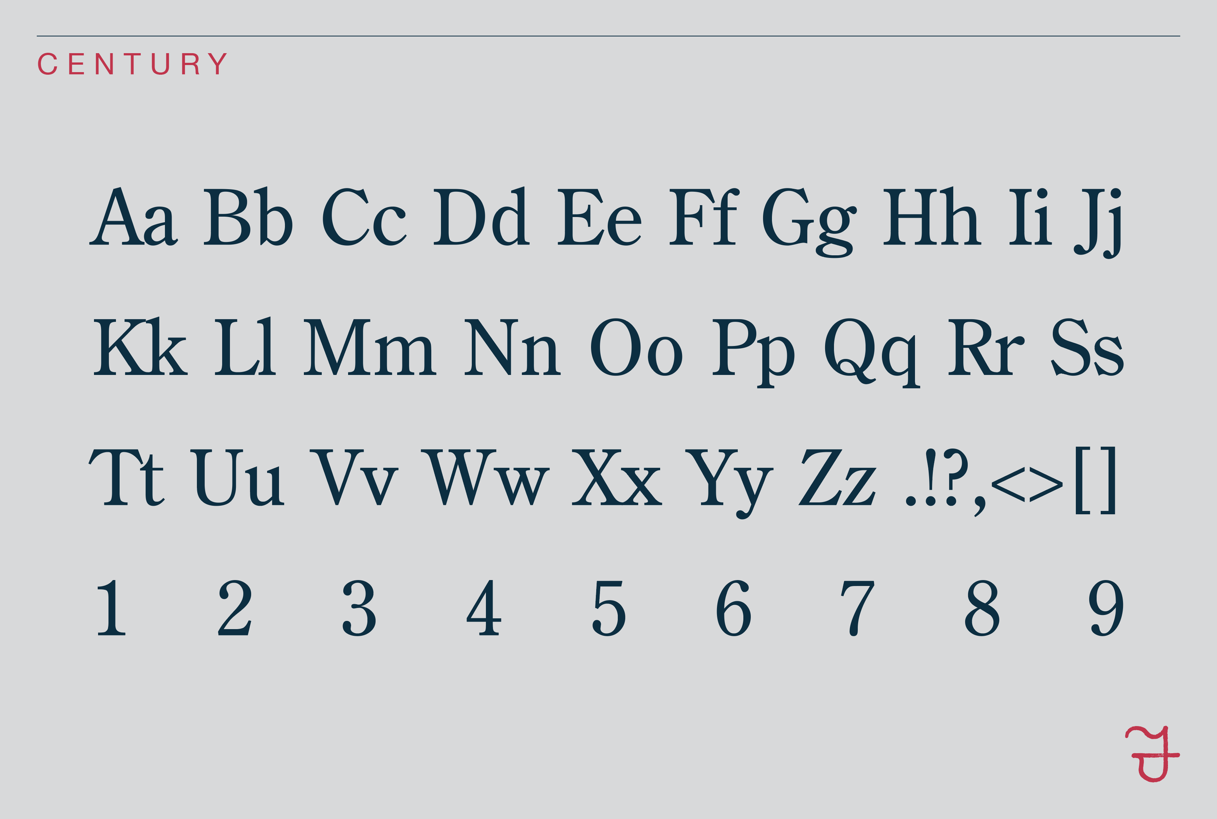
5. Century
History:
Century was created in the late 1800s by Linn Boyd Benton and later refined by his son, Morris Fuller Benton. Originally developed for Century Magazine, the font was designed for long-form reading and needed to be clear and easy to print.
Why It’s a Staple:
Century features wide, open letterforms that enhance readability, making it an excellent choice for textbooks, academic books, and novels. It is not overly decorative but excels at making text easy to digest. Because of its balance and clarity, Century is often used in educational materials and children’s books, helping young readers develop strong reading habits.
The Power of Simple Fonts
What makes these fonts special is their timeless functionality. Although they originated in different historical periods and design movements, they all prioritize readability and usability. They are not trendy or overly decorative—they simply do their job exceptionally well. Designers trust them because they have been proven effective over time.
Massimo Vignelli wasn’t against creativity; rather, he believed typography should serve the words, not distract from them. The goal isn’t to impress readers with elaborate fonts but to help them focus on the content itself. These five fonts have stood the test of time, ensuring that books remain easy to read and enjoyable.
With thousands of fonts available today, limiting yourself to just a few may seem restrictive. However, embracing these reliable fonts can make book design more efficient and effective. Instead of worrying about finding the perfect font, designers can focus on the real goal: creating clear, readable, and engaging books. In the end, typography is about enhancing the reader’s experience, and by using fonts with a proven track record, designers can create books that are both beautiful and timeless.
Work with a Professional Book Designer
Typography is just one piece of the puzzle when it comes to great book design. From layout and formatting to cover design and production, working with a professional book designer ensures that your book meets the highest standards. If you're looking to create a beautifully designed book that’s both functional and timeless, consider working with a Custom Book Specialist at Foglio. Whether you need interior formatting, cover design, or full publishing support, we can help. Get in touch today and find out why authors love working with Foglio!
